
We all know that tracking progress is essential. Over the last two years, Eastside Pathways has moved away from the detailed annual report (a static PDF that gets stale quickly) and toward a slimmer, story-based report (still PDF) paired with a series of always-fresh interactive dashboards. The dashboards are produced using software from one of our favorite local corporations, Tableau.
In theory, the two main benefits of using Tableau are that (1) the data can be updated more regularly than just once a year, and (2) partners can explore the data on their own and find insights that are relevant to their work. In practice, people haven’t known when the dashboards were updated or what to explore.
No longer! Effective immediately, the Data Corner will highlight any indicators with new data since the previous month, with a monthly deep dive into one indicator. We hope that you will bring this information back to your organizations and into your Eastside Pathways collaborative work.
For our first Data Corner, please welcome guest blogger Oliver Tjalve, a sophomore at Bellevue Big Picture School who is currently an intern at Eastside Pathways. Oliver crunched the numbers on kindergarten immunization rates and shares his insight below.
Thank you, Kelly! It’s an honor to write this, and I am excited for the future of the Data Corner.
To start things off for the Data Corner, we will look at kindergarten immunization rates for Eastside schools. Initially, Eastside Pathways used immunization data as a proxy for access to pediatric care. However, just looking at immunization itself is valuable information to have.
I’m sure we know how vaccines work. We expose children to weakened versions of a disease so their body can resist it in the future. However, vaccines are not 100% effective. Additionally, not everyone takes them. Most commonly, children with a medical condition may not be healthy enough to take a vaccine. Some families also have personal or religious beliefs around vaccinations. To make sure everyone is safe, we rely on herd immunity.
Herd immunity—also called community immunity—is the idea that if enough people are vaccinated, the population is probably safe from a disease. For example, the herd immunity threshold for pertussis (or whooping cough) is 92-94%. This means if that percentage of the population is vaccinated, the community is probably safe. If it is less, however, then there is an increased chance of disease outbreaks.
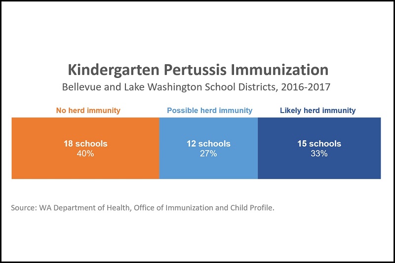
Here is a graph showing pertussis immunization data for kindergarten students at Eastside elementary schools. The orange represents no herd immunity or schools with kindergarten vaccination rates under 92%. They are at risk for pertussis. The light blue represents possible herd immunity or schools with vaccination rates at 92 to 94%. They could be safe, but due to the variance in the threshold it isn’t definitive. The dark blue represents likely herd immunity with a vaccination rate over 94%. They are likely safe from pertussis.
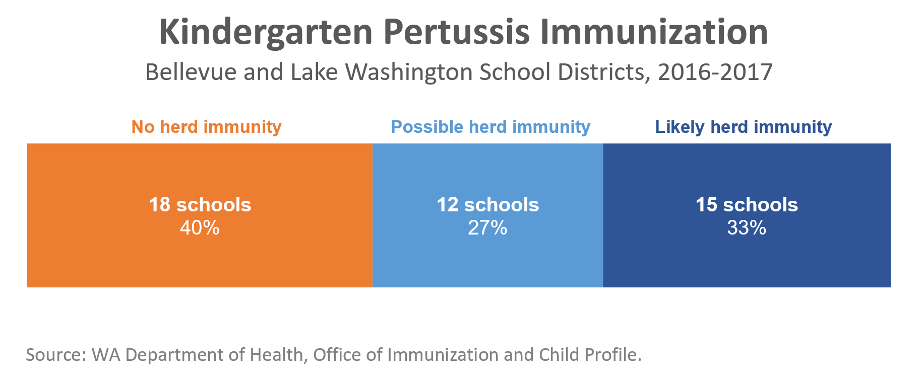
This graph shows that there is a high number of elementary school kindergarteners without herd immunity for pertussis. There are other crucial trends to note with different diseases and vaccination rates. You can look at the last three years of data for all diseases we track on this dashboard. In 2016-17, one elementary school had a 45% overall immunization rate; most of the kindergarten students there were missing one or more vaccinations. It is surprising how many schools do not have herd immunity, and this is definitely worth further investigation and analysis. Some Title I schools (though not all) have lower vaccination rates, which indicates that this may be at least partly an accessibility issue.
These numbers are publicly available thanks to the Office of Immunization and Child Profile at the Washington State Department of Health. The 2016-17 data can be found here. We paired the raw data with herd immunity thresholds from Harvard Medical School.
Once again, please check out the full set of immunization data to explore at your pleasure here. We also track other data that are important indicators of children’s wellbeing. At Eastside Pathways we believe that information is crucial to help, and we thank you and all your efforts in making life better for those in need.
Article written by Oliver Tjalve, a sophomore at Bellevue Big Picture School and currently an intern at Eastside Pathways